House # 3 -Flair
With a house with this contemporary of a style, what could you call it but "The Flair" (which is the actual model name of the house). Yeah, it really could have used more windows on the left side of the house.

The Flair's kitchen is long and thin. Also, the washer and dryer are right next to the sink. You know, I never thought I cared about this until I saw the house, but I want my washer and dryer in a seperate area from the kitchen, not next to the sink. Also, the owners pushed the units apart which makes the dryer stick out about two inches from the kitchen wall, and when you walk in, you can see the overhanging back of the dryer.

However, this place does have a nice dining area in the kitchen that we would have to do a lot with to increase the working space in the kitchen and solve the weird washer/dryer issue.
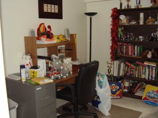
 Looking back on all my pictures of occupied houses, these people were by far the messiest and make me feel like a more normal person.


0 Comments:
Post a Comment
<< Home